Model Data Comparison »
The Model Data Comparison Node is used to display values and charts for experimental and calculated variables in the Project.
Tabbed Views
Actions
Grid Views
Select Variable
Select Sets to View
Select Variables to View
Tabbed Views
Values
Charts
Select Variable
In the Variable droplist you may select the variable whose experimental and calculated numerical values are to be displayed. Typing the first few (up to 5) letters of the desired variable name is a convenient keyboard way to select the desired variable.
By default, this droplist contains variables like compounds, pseudo-compounds, derived quantities, temperature, etc. If the Single Set action is performed, the droplist shows all the included sets in the project. To go back to the default, you must do the Single Compound action.
In the Data Series droplist, you may select among Total Moles or Total Mass and Phase Name options.
For a PFR reactor with Recycle, you will also see the Value Type droplist, where the PFR and Overall options are available. When the PFR option is chosen, you will see information within the PFR reactor, when the Overall option is chosen, only information related to the Fresh Inlet and Overall output of the recycled PFR system is shown. You may explore the Example to learn more about these options.
The Show Parity Plots checkbox is available when you are in the Charts tab. When this option is enabled, the index of correlation p and the Pearson correlation coefficient r are shown in the chart title.
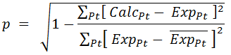
The index of correlation (p) is calculated according to the formula below. It uses the ratio of the total prediction error with the spread in the experimental data. When the prediction error is zero, the p value is 1 indicating a perfect fit. As the prediction error increases, the p value reduces until a minimum value of 0, indicating a poor fit.
where and
and  are the experimental and calculated (predicted) values at the datapoints Pt, while
  is the average of the experimental values in the chart.
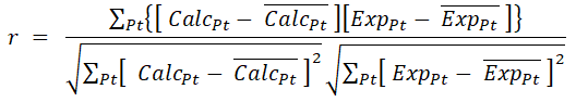
The Pearson correlation coefficient (r) is defined as shown below. The coefficient values ranges from -1 to +1, where 1 indicates perfect positive correlation, 0 is for no correlation and -1 with perfect negative correlation.
The Ignore Zero Measurements checkbox is enabled when the charts are being shown. When this box is checked, the points that have measurements values equal to zero are not displayed in the chart.
Top of Topic In the Variable droplist you may select the variable whose experimental and calculated numerical values are to be displayed. Typing the first few (up to 5) letters of the desired variable name is a convenient keyboard way to select the desired variable.
By default, this droplist contains variables like compounds, pseudo-compounds, derived quantities, temperature, etc. If the Single Set action is performed, the droplist shows all the included sets in the project. To go back to the default, you must do the Single Compound action.
In the Data Series droplist, you may select among Total Moles or Total Mass and Phase Name options.
For a PFR reactor with Recycle, you will also see the Value Type droplist, where the PFR and Overall options are available. When the PFR option is chosen, you will see information within the PFR reactor, when the Overall option is chosen, only information related to the Fresh Inlet and Overall output of the recycled PFR system is shown. You may explore the Example to learn more about these options.
The Show Parity Plots checkbox is available when you are in the Charts tab. When this option is enabled, the index of correlation p and the Pearson correlation coefficient r are shown in the chart title.
The index of correlation (p) is calculated according to the formula below. It uses the ratio of the total prediction error with the spread in the experimental data. When the prediction error is zero, the p value is 1 indicating a perfect fit. As the prediction error increases, the p value reduces until a minimum value of 0, indicating a poor fit.
|
|---|
where
and are the experimental and calculated (predicted) values at the datapoints Pt, while is the average of the experimental values in the chart.The Pearson correlation coefficient (r) is defined as shown below. The coefficient values ranges from -1 to +1, where 1 indicates perfect positive correlation, 0 is for no correlation and -1 with perfect negative correlation.
|
|---|
The Ignore Zero Measurements checkbox is enabled when the charts are being shown. When this box is checked, the points that have measurements values equal to zero are not displayed in the chart.
Select Sets to View
This pane displays all the sets of the Project.
It is available by default, but is minimized and comes into view by moving the mouse to the Select Sets to View tab located near the upper right corner.
This pane is hidden after performing the Single Set action.
It contains the following views:
Top of Topic This pane displays all the sets of the Project.
It is available by default, but is minimized and comes into view by moving the mouse to the Select Sets to View tab located near the upper right corner.
This pane is hidden after performing the Single Set action.
It contains the following views:
- Axis Options : This option is available only after the Custom Axis Chart Option has been enabled by right click on the chart. With this feature, you may override the automatic minimum and maximum values for the chart axis. You may return to the default axis values by selecting the checkbox in the Auto column.
- Series Actions :
- Select All : This allows you to select all sets in the project to be displayed in the Values and Charts.
- Select Inverse : It changes all included sets to be unincluded, and all unincluded sets to be included.
- Clear All : It unincludes all Sets.
- Clear Visible : It only appears when Parity Plots is enabled and the chart has been zoomed in. When performing this action, all included sets that have datapoints inside the zoomed region are unincluded.
- Clear Non-visible : It only appears when Parity Plots is enabled and the chart has been zoomed in. When performing this action, all included sets that have no datapoints inside the zoomed region are unincluded.
- Select All : This allows you to select all sets in the project to be displayed in the Values and Charts.
- Sets to View : The selected Sets are enabled to display their experimental values and the calculated data in the Values and Charts views. By default, all sets are selected.
Select Variables to View
This pane displays all the compounds/pseudo-compounds/derived quantities of the Project.
It is only available after the Single Compound action has been executed. When available, it is minimized by default and comes into view by moving the mouse to the Select Variables to View tab located near the upper right corner.
This pane is similar to Select Sets to View, except that compounds/pseudo-compounds/derived quantities are the variables to be selected to display, instead of Sets.
Top of Topic
Values
This view is stacked in tabs along with the charts, and is visible by default.
This view displays the experimental and calculated variable values at each data point, for the Selected Variable.
Please note that the information displayed is for the compound or process variable selected in the Select Variable grid and for all the sets chosen in the Select Sets to View grid, if the Single Compound action is executed.
If the Single Set action is executed, the information is displayed for the set chosen Select Variable grid and for all the variables chosen in Select Variables to View grid.
For the derived quantities and the pseudo-compounds, the values are shown for Total Moles or Total Mass and they are obtained by the methods detailed in Note1.
Top of Topic
Charts
The chart is stacked in tabs along with the Values view. As it is not shown by default, you may view it by clicking on the Charts tab.
This chart displays the experimental and calculated variable values at each data point, for the selected Variable.
As described above for the Values tab, the information displayed here depends on the choice of single set or single compound.
For the derived quantities and the pseudo-compounds, the values are shown for Total Moles or Total Mass and they are obtained by the methods detailed in Note1.
The way the information is displayed depends on the selection made on the Show Parity Plots checkbox in the Select Variable view:
Chart Options
You may use the Zoom In/Out features in this chart. When a chart is zoomed in with the Parity Plots enabled, the series with datapoints inside the zoomed region are indicated with green font in the Select Sets/Variables to View grid and placed on the top of the list.
There are additional options available on right clicking the chart, as described below.
The chart is stacked in tabs along with the Values view. As it is not shown by default, you may view it by clicking on the Charts tab.
This chart displays the experimental and calculated variable values at each data point, for the selected Variable.
As described above for the Values tab, the information displayed here depends on the choice of single set or single compound.
For the derived quantities and the pseudo-compounds, the values are shown for Total Moles or Total Mass and they are obtained by the methods detailed in Note1.
The way the information is displayed depends on the selection made on the Show Parity Plots checkbox in the Select Variable view:
- When the Show Parity Plots box is not checked, the X axis shows Time for Batch reactors, CSTR Number for CSTR reactors and Volume or Catalyst Mass, according the selected Rate Basis, for PFR reactors. The Y axis shows the experimental and the calculated values for the selected variable.
- When the Show Parity Plots box is checked, the X axis indicates the Calculated value and the Y axis indicates the Experimental values for the selected variable.
Chart Options
You may use the Zoom In/Out features in this chart. When a chart is zoomed in with the Parity Plots enabled, the series with datapoints inside the zoomed region are indicated with green font in the Select Sets/Variables to View grid and placed on the top of the list.
There are additional options available on right clicking the chart, as described below.
- Copy : It copies a metadata file of the graph so it can be pasted into a Powerpoint, Excel or Word file. It can be also be done by pressing "Ctrl + C" keys. When you paste into the destination file, the size of the figure will be the same as seen in the chart view.
- Copy Fixed : It copies a jpg file of the graph with a predefined size to the clipboard. Thus, when pasting it into the destination file, the size is fixed and independent of the size of the chart view. This is useful when you are copying several charts to a powerpoint report and would like to preserve the same size in the report. This copy can also be done with the "F" key.
- Export Image : It saves the chart into a jpg or gif file.
- Show Series : By default, it allows you to visualize All Values: experimental and calculated variable values. You may choose to see each of them separately by using the Only Experimental or Only Calculated options.
- Show Points : By enabling this option, all collocation points are indicated in the Calculated series through a small square. By default, the option is disabled.
This option is not available when Parity Plots is enabled.
- Show Legend : It allows you to hide/show the Legend of the chart. This again is useful when you want to make reports with several charts.
- Custom Axis : It enables the Axis Options grid in the Select Sets/Variables to View grids.
- Parity Deviations : It is only available when Parity Plots are enabled. You may select the available percentage values in the combo to easily visualize which predictions deviate more than 10, 15 or 20% with respect to the corresponding experimental values.
Two dotted lines are drawn below and above the identity line: the points inside these lines are the ones within the specified prediction error. - Properties : It allows you to change advanced options on the graph.
Top of Topic
Actions
Single Compound
Single Set
Single Compound
By default, the variables are displayed by Single Compound. That means that you can display any variable (like compound, pseudo-compound, derived quantity, temperature, etc.) chosen in Select Variable grid, for the sets included in Select Sets to View grid.
Single Set
This action is used to display information for all marked compounds/pseudo-compounds/derived quantities in the Select Variables to View grid and for the chosen set in Select Variable grid.
Top of Topic
See Also: